
I mostly write about Crypto. I’ve written about “Why Crypto’s A Growing Threat To FAMGA (a.k.a. Facebook, Apple, Microsoft, Google and Amazon)”. But that’s in the future. This post is about how after being a massive Facebook’s bull for 8 years, I turned negative in January because of one chart.
I’ve written about how I became the original Facebook bull after I published the first Wall Street style research report on Facebook in March of 2010. My revenue forecast was my estimate of Facebook’s % of total internet time spent on the site multiplied by an estimate of the total global internet ad market. My 2014 revenue estimate of $12.3 billion was off the actual 2014 revenue of Facebook by 1%. It turns out Facebook is simply monetizing people’s time.
I remained a Facebook bull for eight years, as the company continued to increase user engagement (defined as DAUs/MAUs once the company started reporting results). I’ve long believed that sites are growing engagement, or they’re dying, and for eight years, Facebook was growing user engagement.
But when the company reported Q4 ’17 earnings on January 31st, 2018, for the first time in it’s history, Facebook’s user engagement declined, and I turned bearish, penning this blog post to note the occasion.
On April 25th, Facebook reported Q1 ’18 earnings, and Wall Street applauded the results, sending the shares up 10%, adding $45 billion in market cap, as Facebook’s revenue surged 49%, year-over-year, to $12 billion. While Wall Street cheered, I saw another signpost of Facebook’s impending doom. Shockingly, Wall Street, even after all those years, still didn’t understand Facebook. Wall Street has never understood Facebook, because they don’t appreciate there is only one chart that matters when looking at Facebook.
The One Chart Investors Should Focus On
Following Q1 ’18, I wrote this blog post highlighting the one graph I felt investors should be focused on. Now after Q2 ’18 results, I’m updating that chart below. While Facebook presented 19 slides on their conference call yesterday, they didn’t present the one below, which, in my opinion, is the most important graph of all. It shows the year-over-year change in user engagement, which is defined by Facebook as Daily Active Users/Monthly Active Users (DAU/MAU). It is not a pretty picture:
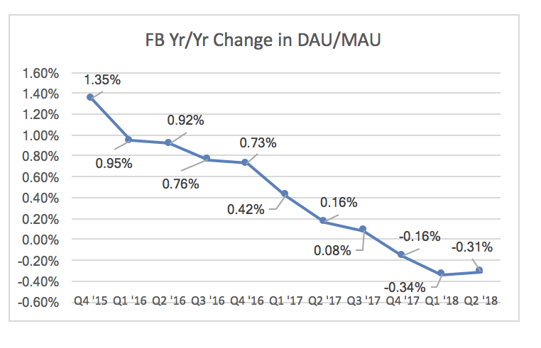
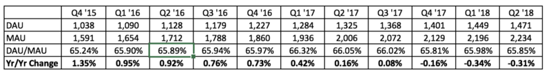
In other words, the average Facebook user spent less time on Facebook for the third consecutive quarter. Given that Facebook’s main model is to monetize user time, less time per user is ultimately disastrous. So I finish this post with the same warning as my last two Facebook posts: Investors Beware.
